By clicking on the link below you will be transferred to my WIX site on which I have displayed all the answers to my evaluation questions.
http://shannonmarierosali.wix.com/shannonsdomain
Saturday, 19 April 2014
Monday, 17 March 2014


Thursday, 20 February 2014
Evaluation Question 7
LOOKING AT YOUR PRELIMINARY TASK (THE SCHOOL MAGAZINE TASK) WHAT DO YOU FEEL YOU HAVE LEARNT IN THE PROGRESSION FROM IT TO THE FULL PRODUCT?
Evaluation Question 6
Evaluation Question 3
WHAT KIND OF MEDIA INSTITUTION MIGHT DISTRIBUTE YOUR MEDIA PRODUCT AND WHY?
Initial ideas of what I could do:
 HEARST - produce 300 worldwide magazines with their UK company Hearst UK publishing 20 magazines in Britain including Cosmopolitan, Men’s Health, Elle, Esquire, Good Housekeeping and Company. They also run 20 major websites including GetLippy.com and Sugarscape.co.uk. They also publish 30 international newspapers, 2 radio stations, 30 international TV Channels, 3 international online channels (egCosmopolitan TV) and several real estate companies. They also co- own another magazine company with a US company (Rodale) called Natmag Rodale (health magazines) and co-own a distribution company called COMAG with Conde Nast. Hearst UK tried to buy another magazine company EMAP in 2009 to increase their power but their bid of £700 million was turned down.


 BAUER (incorporating EMAP) – They produce over 280 magazines worldwide with
Initial ideas of what I could do:
- 'in the style of' video such as the apprentice, dragons den, interviews with each publisher...
- powerpoint presentation made faster on imovie of magazine distribution and info on the main companies alongside small vid/audio of which one would publish my mag.
Magazine distribution is the link between the magazine producers and retail outlets. The outlets are the stores where the magazines are sold and are mostly places which have a large magazine section such as WHSmith. The producers creates all the major aspects of the magazine including the structure and the content. The producers then send the finished magazine to distribute retail ors who will market the magazine and will also aim to advertise the magazine to help target audiences to buy the magazine. There are also several other institutions in the magazine industry which are involved in the production and advertising process before distribution. There is a chain of institutions involved in the production process, firstly, there is the magazine producers who are in charge of funding the magazine and using the funding for new resources to create the magazine. The producers create the structure and the content of the magazine, they also create the final product ready for publishing.
 IPC MEDIA – The UK's leading consumer magazine and digital publisher. They produce 60 magazines in Britain including NME, Nuts, Woman’s Own, Marie Claire, Loaded etc. Their magazines get bought by 26 million people a month, and their websites get visited by over 26 million people globally a month - almost two thirds of UK women and over 40% of UK men. They also create content for multiple platforms not only across print and online, but through mobile, tablet and events. The magazines published by this company which are most relevant to my media product include NME and Uncut:
Uncut: 56,894, down 9.7 per cent yr on yr, New Musical Express: 20,011, down 16.4 per cent yr on yr
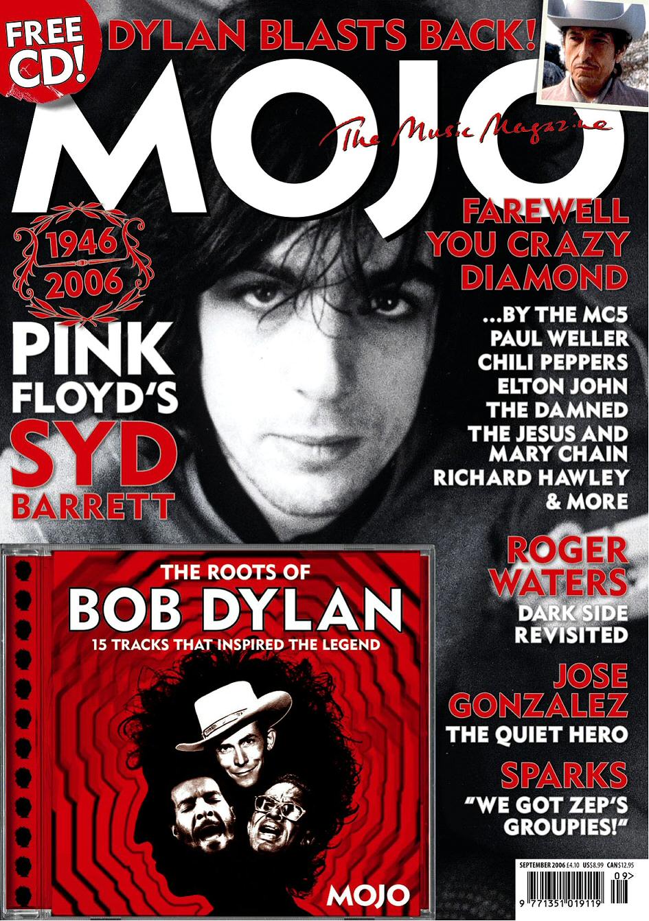
80 of those in Britain including Bliss, Grazia, Empire, FHM, Heat, Kerrang, Take a Break and Q. Bauer bought EMAP (a magazine company) for £1.4 billion in 2009 and have carried on producing their magazines since then. Reaches over 19 million uk adults every week. Also own KISS 100, Magic 105.4 and 4music. They connect people and communities with compelling and quality content whenever, wherever and however they want. The magazines published by this company which are most relevant to me are MOJO, Q and KERRANG, MOJO, Q:


Evaluation Question 2
HOW DOES YOUR MEDIA PRODUCT REPRESENT PARTICULAR SOCIAL GROUPS?
http://shannonmarierosali.wix.com/shannonsdomain#!models/cee5
http://shannonmarierosali.wix.com/shannonsdomain#!models/cee5
Evaluation Question 1
IN WHAT WAYS DOES YOUR MEDIA PRODUCT USE, DEVELOP OR CHALLENGE FORMS AND CONVENTIONS OF REAL MEDIA PRODUCTS?
Friday, 14 February 2014


Tuesday, 11 February 2014

Sunday, 9 February 2014
Friday, 7 February 2014


Wednesday, 5 February 2014
Draft Double Page Spread article
RIDING SOUL-O
“I feel like I’m ready to step out of the shadows and
into the limelight”
Above is what I am
planning to have as my Headline and Pull quote for the main cover story. Below
is the double page spread article written in draft which will require some if
not many changes to be the best quality it can be and to resemble other
professional and famous music magazines in the country:
Strolling through the infamous Leicester Square in West End
London on a cold and icy December afternoon, her entourage consisting of only
four security guards, Annalisa Ambros is a face many are surprised to see.
Flanked by fans of the Grammy-award winning girl group Liberal Ladies of which
Annalisa is a former fifth member, iPhones are held up left-right-and-centre
and anxious press are shouting over one another to get their million-dollar
question answered first. Annalisa continues to stroll at a faster pace until
raising her head ever so slightly. She flicks a long strand of her freshly
trimmed Jet Black weave behind her shoulder to reveal the most innocent of
smiles. I sit anxiously in the foyer of Asia De Cuba, this musician’s favourite
restaurant on St Martin’s Lane, anxiously observing her arrival through the
glass wall entrance.
In she comes, brushing the remains of frost and sleet off of
her Lipsy London brown, suede coat and on seeing me, she flashes me that wide
grin that almost every newspaper and magazine had captured in group
photographs, but who had never gone into depth about the character behind it.
As I stand up to greet her I notice this songstress is rocking a hip, fresh and
modern style sporting Dark Levi jeans with heeled thigh boots and a faux fur
waistcoat, paired with oversized hooped earrings and that signature rich, red lipstick.
“Your hands are cold”, she says giggling as much as the cold air allows her to.
I smile and feel warmed by her easy-going nature making it easier for me to
begin my first question.
“Well, what a
jam-packed year it’s been for you!”
“Indeed it has hahah!”
“First of all the allegedly
sour splitting up of Liberal Ladies, then your signing up to a new record label
as a solo artist and now the release of your Debut Album SENTIMENTAL is
approaching! What are your thoughts about the events this year has brought to you?”
“Well when you put it like that it’s been a long and winding
tale of twists, turns, set-backs and achievements. But to be honest I wouldn’t
change a thing - even the really grey areas hahah. I’ve learnt so much about
myself this year it’s been like a sort of self-discovery process for me – and a
well needed one at that!”
“You mentioned the grey
areas. Your group Liberal Ladies formed in late July 2010 released the hit
debut single “Kill My Vibe” in February of 2011 which reached the UK top 20
landing an impressive place at number four. Since then you have had four songs
reach the UK top 10, 1 of which had a roaring success maintaining at number 2
for several weeks in the UK charts and ranking the 3rd most
downloaded song on ITunes of 2011. What went wrong?”
“It’s a very complex subject but one I don’t mind talking
about at all and in fact feel that a few things regarding the alleged spat between
lead singer Cassie Emejuru and myself. I cherish every single moment that I
spent with the girls in that group, but after the commotion and chaos that came
with our second single’s success, I knew something was up. I wasn’t happy
anymore. I felt like every red carpet, every premiere, every tour and every
photo shoot was a lie, I felt that I was handing the power that all five of us
originally shared, over to one person. I felt like all of the hard work, advice
and effort I was putting into the song-writing and recording process was
constantly being ignored and dismissed. It was like in school when people would
push in front of you in the dinner line and you’d have to wait longer and
longer to be served. I was waiting and waiting for 18 months for my voice to be
heard and I started to buckle under the pressure of ‘keeping up appearances’.
On top of this, I felt like the music we were producing was becoming too
electrified and techno and instead of producing funky R&B tracks we began
to produce predictable, club/dance tracks which slowly started to sink in the
charts.”
“So was that the
reason you split up?”
“Not necessarily, I think I was the first one to become
increasingly aware of my need for departure from the group, because I was
feeling controlled, restricted and overpowered by Cassie, whose confident
bravado and easy ability to get to know people worked in her favour as the lead
singer. Me on the other hand, have always had a hard time with this aspect of
fame and felt like I was being disconnected with the real reason I ever fell in
love and wanted to pursue a music career, so the music could touch people. If
someone’s telling me how I can and can’t do my job, then you won’t see me
sticking around for long, because to them it might be just a job but to me,
it’s a passion.”
“Inspiring words! How
does your relationship with the band members stand now?”
“After everyone else decided that they too could feel the
negative vibes within the group, we all kind of went our separate ways.
Charmaine I know dreamed of starting a family and I believe is doing spots of
TV presenting here and there, so everyone is keeping well and at the moment
it’s a pretty unanimous feeling that the break-up was for the best! I keep in
touch with them all though – even Cassie!”
“Well now that that’s
cleared up I think it’s fair to say that you have been extremely successful in
taking the risk of going solo. How are you finding it?”
“Massive culture change!” she gasps and gulps some lemonade
from her glass. “I do miss the girls. No matter what happened there some
seriously wonderful times had and experiences shared it’s really a shame that
it had to end this way. But with every cloud there’s a silver lining and you
just have to look at the positives out of the situation. I now realise the path
which I wish for the rest of my life to go down and its time for me now to
focus on my OWN music. It’s a perfect time for me to song-write as I have come
through a lot and being to come out as a solo artist from all of this has made
me feel like I’m ready to step out of the shadows and into the limelight.”
“And that you
certainly have! The release of your debut album SENTIMENTAL is due to be
released on 31st March 2014. Tell me a bit about it.”
“It’s called sentimental because nearly every track on the
album is solemn, soothing and expressive of true emotion. I’ve completely
stripped it back and reverted to my old musical tastes, the reason I wanted to
do music in the first place! It’s like I’m my own boss now, it makes making music
a lot more fulfilling and exhilarating now more than ever. I have found my own
style, my own sound and my own voice, and am hoping and praying that Liberal
Ladies fans will stick with me on my journey into the fascinating discovery of
Neo-soul twists on R&B funk.”
And with that, Annalisa Ambros released a sigh of relief
that the interview was over, resuming to the wonderfully outgoing and bubbly
personality that I had witnessed come through that door. It’s clear that this
intelligent and well spoken chick has gone from shy to fly and I wish her all
the best in the success of her single SENTIMENTAL. It will definitely be on MY
Christmas list!
Tuesday, 4 February 2014
Double Page Spread Research
Before I could go on to plan my double page spread any further, it was vital that I take a good look at what competing magazines are producing for their features, and therefore gaining insight into how to attract my audience in the best way...
DPS ANALYSIS 1 - VIBE - Nicki Minaj .jpg)
DPS ANALYSIS 2 - VIBE - Solange Knowles

DPS ANALYSIS 3 - THE SOURCE - Rick Ross
Although a HIP HOP/RAP magazine, The Source is a valid and reliable call of research for my design/layout because it contains many elements that make it distinctive and unique in its style. The example I have includes 4 double page spreads on RICK ROSS, who is not the main feature image on the front page, but is on the Contents...

Across the 4 DPS's there are 5 large, main images, all of which stand out particularly in their own right. The first DPS is a conventional, first one introducing the featured artist RICK ROSS, and because it is starting off the article, the page is dominated heavily by the image which is landscape and therefore covers the entire page. The text has been tailored to fit onto this background photograph. With the image photoshopped so that there is a gradient of darker grey toward the right hand side of the DPS, this allows for large, white font in upper case letters to be clearly visible to the target reader. The main heading on this page and body text underneath is all left justified and the main, most impacting, influential words in the title (HAND, EYES, THRONE) are each given their own line as the longest words, and so stand out more because they are longer and are emphasised to the reader. The power of them then draws the reader in. Although hard to see, before the article leads onto the next page, it also states in smaller font the person in charge of the 'words' and the person in charge of the 'images'. The small paragraph of text itself, includes 2 rhetorical questions and addresses the reader as 'you', with the tone/register hence being quite informal and colloquial through abbreviations and dialect associated with the target readers such as 'cutting' 'records' 'shot' and 'MMG'. The image itself is a mid shot and the mise-en scene is particularly captivating as the artist is situated in front of a brick wall which has patches of dirt and mud connoting the grime/rap style of his music. By contrast, he is wearing a blue, faux furr jacket and a golden chained bracelet which connotes wealth and is an iconic symbol.
Interestingly, the layout of the 2nd DPS is in the form of 2 wide columns and also uses a Drops Cap on the 'C', a design feature that many magazines have. Once the introduction is finished, the interview kicks in more or less straight away and we can distinguish between the voice of the artist and the writer from the bolded capital text "SHAHEEM REID:" and "RICK ROSS:". We begin to see a consistent house style from page to page with there being 2 columns of text, and a page next to it, 2 columns on a page and an image next to it. As well as a drops cap, a pull quote has been inserted into this DPS. The style of it is the same font as the drops caps but instead of being in speech marks or highlighted in bright colours or in big colourful boxes like in some pop magazines, this pull quote has simply been enlarged, made bold and is in capital letters and spread across the entire width of one A4 page. It is more or less in the centre of the page drawing attention to it instantly. The image on the right has a very simple background, a white brick wall, again with dirty marks on it, and a plain tiled floor. Much like the first picture, Rick Ross' hands are both raised and his position on the page gives us a full length shot of him.
The third and fourth dps are very similar in layout except the magazine ident "THESOURCE.COM PAGE NUMBER THE SOURCE" appears in the bottom corner of of each page apart from those with images. The final dps of the four includes a second picture on the right a4 side and and underneath is a second pull quote which this time is in quotation marks with some in smaller text. At the end of the article there is a small symbol of a red circle with white 'S' inside of it. This captures the magazine identity as well as maintaining a house style throughout.
Monday, 3 February 2014
Front page, contents and DPS comparisons
I have decided to analyse the front cover, contents page and double page spreads of magazines across different genres because although they may be different to the music featuring in my magazine, the principles will for the most part apply to what I am trying to design and the main aim is to see what kinds of things are persistent across all three pages of a magazine e.g: page furniture, other design elements, typography/font, colours,etc...
1st comparison


 Vibe magazine is well known for its signature simplistic style, however glamour and subtle hints of sophistication and colour tie together an appropriate house style across all three pages. On the front page, the main model is centred connoting her importance and she is shown kneeling down naked wearing nothing but a pair of high heeled black wedges. With regards to iconography, Ciara is presented as a typical, sexy and alluring black female singer, which would attract the male population of the magazine's target audience. On the contents page, the same model has changed outfit into a grey leotard with long sleeves although with the addition of hand jewellery, she is still wearing minimal clothing and sexual allure here is portrayed through her stretched bare legs, this time wearing a different pair of sliver shoes, still high heeled. The model is in a bent position once again on this page. The dark grey to white gradient used for the front page background has been carried through to the contents with dark grey at the top and white nearer the bottom. Finally, there are two focal images on the double page spread the first one being a long shot of Ciara's entire body. She is once again naked here, wearing the same as on the front page, however the difference in position and placement on the page makes it more interested and appealing. Apart from the few orange sub headings on the DPS to resonate with the odd large bold text, in red font on the front page, the colour scheme is mainly made up of greys, blacks and white, meaning the house style is maintained throughout this magazine, very well.
2nd comparison
In this issue of Big Cheese, Sleeping with Sirens are promoted as the feature band and their importance/dominance over the magazine is maintained consistently across the contents page and double page spread. On the front page, we see a long shot of all five members from head to toe. Their facial expressions appear stern and serious, and their clothes are all smart/casual. Interestingly, they are photographed wearing the same clothes on the contents page, where they are dedicated a slightly larger picture than the rest on the page. In addition to this, the reader is attracted straight to the picture of them as it is positioned in the top of the left hand page, the area the natural eye is drawn to instantly. In their image on the contents page, the band members are all photographed but are each standing in a different position, except the man in the middle of the front page. He is kept constantly in the middle of the band from the front page, to the contents to the DPS. This cleverly signifys and maintains that HE is the lead singer of the band.


Saturday, 1 February 2014
Audience Expectations
To present the expectations of my audience, I created a comic strip using www.pixton.com

To help me discover these expectations, I also handed out typed surveys to a handful of my target audience and above are some of the responses that I gained.
To help me discover these expectations, I also handed out typed surveys to a handful of my target audience and above are some of the responses that I gained.
Thursday, 30 January 2014
Contents Page Analysis

.jpeg)
 The first thing I notice about these two contents pages from separate issues of NME is that, the masthead is included in the top left hand corner of the page, normally where the reader looks first, and this reminds them of the magazine they are reading. With the addition of the text ‘This Week’, they are also told that below is everything they can expect to find within this issue of the magazine.
Traditionally split into three columns, the first is a band index, literally just a list of bands that feature and the page that they feature on, which links effectively with the genre of music for this magazine including especially big famous bands. The red background of this long text box matches the colour of the masthead as well as the page numbers on the right hand side and box in the bottom right hand corner. This adds to the house style and makes the page look aesthetically pleasing.
The main cover lines such as ‘NEWS’ ‘RADAR’ and ‘REVIEWS’, etc. have been used to categorise the different articles into different appropriate sections, in order to make the page clearer for the reader to dissect and follow as they read through. Bolder text has been used for the main artists featured under each large heading, drawing attention straight to them first of all. Then, there is text of a smaller font size which has been used to describe the caption above it, issuing detail but not an overload of information.
Some graphic design elements have been added to both pages such as the four light blue arrows, a contrasting colour to that of the house style, and therefore they create interest for the reader to look upon and focus themselves onto the cover lines that have been pointed at.
All the way through this page, the main biggest, most important stories or artists have been made bold, coloured in red or made a larger font size so that something is different about them compared to the other body text, making them stand out above everything else on the page.
Central but at the bottom of the page is where the ‘SUBSCRIBE’ box has been intentionally placed as it allows room to be quite a wide box and having a black background links it to the cover lines and contents heading. The fact that ‘SUBSCRIBE TODAY SAVE 33%*’ has been written in capitals and in the colour yellow, effectively makes it more eye catching and jumps out at the reader so they feel obliged to go to this page for such a bargain of a subscription!
This contents page is from Vibe and as you can see here, it
is one out of three. With a lot of content to promote in this bi-monthly
magazine, Vibe excel themselves in maintaining their simplistic, raw and
elegant pages but having three so that all content can be evenly spread and
presented in similar ways in keeping with the house style. On this example, the
model is Ciara, whose photograph dominates the entire page making her the focal
point where attention of the reader is instantly drawn to. Her position, facial
expression, clothing and accessories all aid in connoting a glamorous and sexy
appeal grabbing the male reader’s eyes and captivating them to read on. It is
traditional on any Vibe magazine, to have the ‘V’ enlarged and displayed in
some other format across the contents page, and here we can see that although a
very faint white outline of a V is present in the background, the model’s legs
are also crossed to create a ‘V’ shape, and this connects successfully with the
text.
On this example, the
model is Ciara, whose photograph dominates the entire page making her the focal
point where attention of the reader is instantly drawn to. Her position, facial
expression, clothing and accessories all aid in connoting a glamorous and sexy
appeal grabbing the male reader’s eyes and captivating them to read on. It is
traditional on any Vibe magazine, to have the ‘V’ enlarged and displayed in
some other format across the contents page, and here we can see that although a
very faint white outline of a V is present in the background, the model’s legs
are also crossed to create a ‘V’ shape, and this connects successfully with the
text.
There is three-point lighting across the page which means
that certain parts of the model’s body are highlighted more than others and the
gradient from black to white for the background, emphasises her shadow.
The colours used also compliment each other very well and
tie together to form a house style. The grey/silver colour of the models
leotard, shoes and jewellery matches the faded silver background and as silver
connotes wealth, the magazine appears expensive and professional quality. With
her legs stretched out, blemishes on all of the skin have been removed and so
her bare legs look flawless, smooth and elongated fitting in with the iconography
of females within this genre of music, that they to stay looking healthy, sexy
and curvy at all times, and should wear minimal clothing.
The masthead itself has been adjusted in quite an unorthodox
way with the each letter being rearranged and in white block capitals. This
font style contrasts to the rest of the text on the page where ‘Features’ and
‘Fashion’ still stand out, but due to the fact that they are black and bold,
with page furniture added next to both words denoting a small arrow, directing the
reader to wear they need to look.
Small black dots have been used to separate each contents
feature by contrast to those such as Q and NME magazine who pride themselves
for using large, chunky, bold and bright strips of colour to separate their
cover lines.
On this contents page also, there is a really special
element of professionalism as every piece of content has next to or under it,
the names of the people who wrote or photographed this part of the magazine.
At the bottom, Vibe conventionally states the date of this
issue, page number and name of the magazine in bolder font.
The page numbers for the contents here start at page 90 and
end on page 122. This is due to it being part 1 of 3 contents pages and the
first part has shown to be for the MAIN stories/features in this magazine,
which from research I have found to usually appear right in the middle of most
magazines like this one.

This is from XXL magazine whose contents pages are split
into two; ‘the-A-side and the-B-side’, which like Vibe allows all the contents
to be spread out and not be too bunched together.
This is slightly different to Vibe in the light that it does
not have one consistent colour throughout, but rather a colour scheme is
followed.
The main image on this page is effective because Chris
Brown’s face is unrecognisable, creating suspense and making the reader curious
as to what he might be hiding. The dress of this artist also adds to the
iconography of the hip-hop/rap/R&B genre because hoodies are a major item
of male clothing and the scarf he is wearing paired with chino trousers and
expensive designer boots, make him look prim, proper and stylish, appealing
very much to the target audience.
In addition, there is a pull quote on this contents page
which is larger font size than the rest of the cover lines and because it is
underneath its own black separator strip, directly next to the model’s
shoulder, we can tell that the quote is about him.
With simply a white background, the page looks quite plain
but other areas make up for the lack of colour such as the very top of the page
where, underneath the masthead, there is a black strip with the date and year
as well as the masthead being in smaller size on the right hand side of it the
bar. ‘Features’ is also in red brackets and follows onto the pull quote,
however, this could be interpreted quite unclearly to some readers as it
doesn't look separated from the masthead at all.
There is a great, effective design element in the form of a
white play button on a red background, which is the exact same form as the
title ‘XXL’. This means the reader can tell what magazine they are reading just
from looking at the bottom of the page.
.jpg)

This is the contents of
Hip Hop magazine which shows quite a different format and style to other music
magazines of this genre. In a conventional 3 column form, the most important
words and names of artists are in black bold font and all page numbers are in
red, making them fit with the house style colours of red, white and black.
TO BE COMPLETED
Tuesday, 28 January 2014
Front Page Construction
I HAVE CREATED A VIDEO TO SHOW HOW SOMEONE ELSE COULD CONSTRUCT MY FRONT PAGE
Monday, 27 January 2014

Sunday, 26 January 2014

Thursday, 23 January 2014
Front page Feedback
By asking a bunch of Year 13 students currently studying Media, this is the feedback that they gave me on my current front page. One of the comments was that Justin Timberlake does not fit into my genre of R&B music. However, I then decided to Google a list of R&B artists and by scrolling down to T, for Timberlake, his name appeared. Also, I looked the man himself up and various different sites labelled him as a pop/R&B artist and the fact that there are other elements and some aspects of different genres like dance and hip hop in his music, gives my magazine the more diverse feel that I am hoping to create and for this reason, I have chosen to stick with Just Timberlake featuring in my magazine.

Friday, 17 January 2014

Tuesday, 14 January 2014
Page Furniture/Design Elements
No magazine can truly excel in the industry with some design elements and page furniture, as these have a number of purposes and important responsibilities including making the magazine more appealing and attractive to its audience through visual stimulation, as well as helping to produce a clearer cut house style throughout.


Subscribe to:
Comments (Atom)